Interior emphasis: the role of colour, light and texture
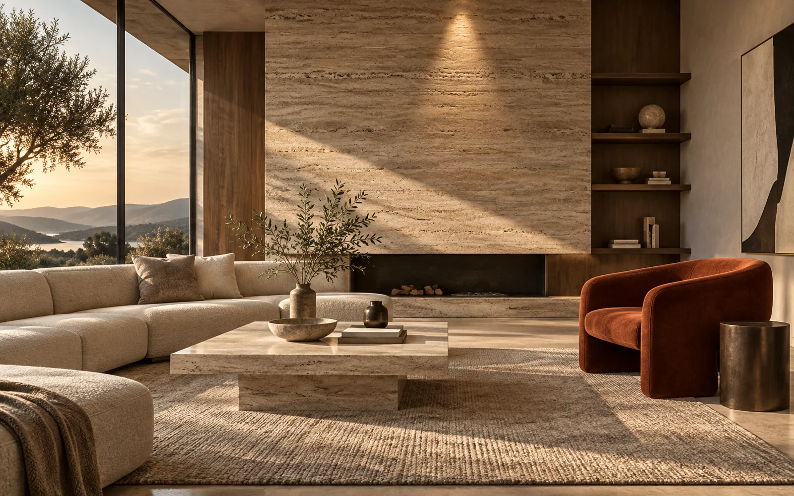
Emphasis makes one element more noticeable than its surroundings. If a focal point is where attention settles, emphasis is one of the ways we direct attention there. Colour, light, scale, shape and texture can work separately or together.
Choose contrast with a purpose
A rust-coloured chair can stand out in a cream and beige room. This does not require painting every wall a strong colour. What matters is a clear difference between the selected object and its background.
Direct light carefully
Light aimed at a decorative wall can reveal its texture. The light source should not create uncomfortable glare for seated users. Check the evening scene as well as daylight: the same accent can feel very different under artificial lighting.
Consider quieter accents
Emphasis does not always mean a bright colour. Rough stone among smooth surfaces, a large artwork against a neutral wall or a sculptural shape among simple furniture can provide an effective accent.
Maintain a hierarchy
Choosing one main accent and allowing other details to support it is a useful starting point. Too many competing elements can make the room feel tiring. Look from the entrance and the seating area: does the intended feature remain clear, or is attention scattered? Successful emphasis adds expression while preserving the overall harmony of the interior.
Related reading
- Interior focal points: how to give a room a clear focus
- Asymmetrical balance: harmony through different elements
Editorial note
Adapted from the supplied source material. The cover is an AI-generated conceptual illustration, not a completed project or a technical drawing.
Discuss how these principles could apply to your project with Raul Architects.
Discuss your project →